Rad Portfolio Pieces
This page contains the things that help represent my creativity.
Anti-Money Laundering and Terrorist Act Compliance Regime
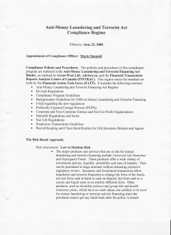
While working at a financial firm, I put together a 30-plus page compliance regime according to national standards. This is the first page, a small sampling of the regime, that continues to be used successfully in the corporation.
Event Poster
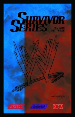
The task was to create a poster for an event that would have more than 1000 attendees. The 2009 November 22 Survivor Series pay-per-view had 10,500 in attendance.
The Raw, Smackdown, and WWE logos are brushes, while I created the ECW logo myself.
The colours chosen are symbolic in that blue is the colour of the Smackdown brand, with red being that of Raw. I made blue the dominant colour, as Smackdown won 2 out of 3 matches at the previous pay-per-view, Bragging Rights, making them the dominant WWE brand of 2009.
Print Ad
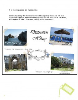
Part of an advertising campaign proposed to Winnipeg jeweler Hilary Druxman I called Destination Hilary, this sample print ad well-represented the theme of the entire campaign. Destination Hilary was about the experience of wearing Hilary Druxman jewelry; each piece represented a different culture or country, and would thereby whisk the wearer away to that foreign experience. Each location, Nova Scotia, Jamaica, Scotland, and Georgia, USA, is represented by a specific piece from one of Hilary's 53 collections, with the big idea being, 'where are you going to go?' What possibilities are available? With the right jewelry, you have the world at your fingertips.
All the photos were originals taken from my own collection, and remain untouched. The two photos on the left (represented by Nova Scotia and Scotland) were actually taken in Bermuda, while the two on the right were taken in Jamaica.
The travel tag at the bottom of the page was part of the on-going theme, and that brush was placed on each page.
Direct-mail postcard
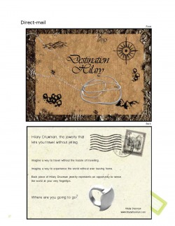
A continuation of the ad campaign I proposed to Hilary Druxman, this sample was a direct-mail piece of a postcard that worked along the theme of travel and Destination Hilary. While the idea of travel is still significant in the design, the jewelry still stands out on both the front and back.
The front map and back postcard were designed using patterns and brushes in Photoshop CS3, while the copy was added in Adobe InDesign CS3.
The front map and back postcard were designed using patterns and brushes in Photoshop CS3, while the copy was added in Adobe InDesign CS3.
